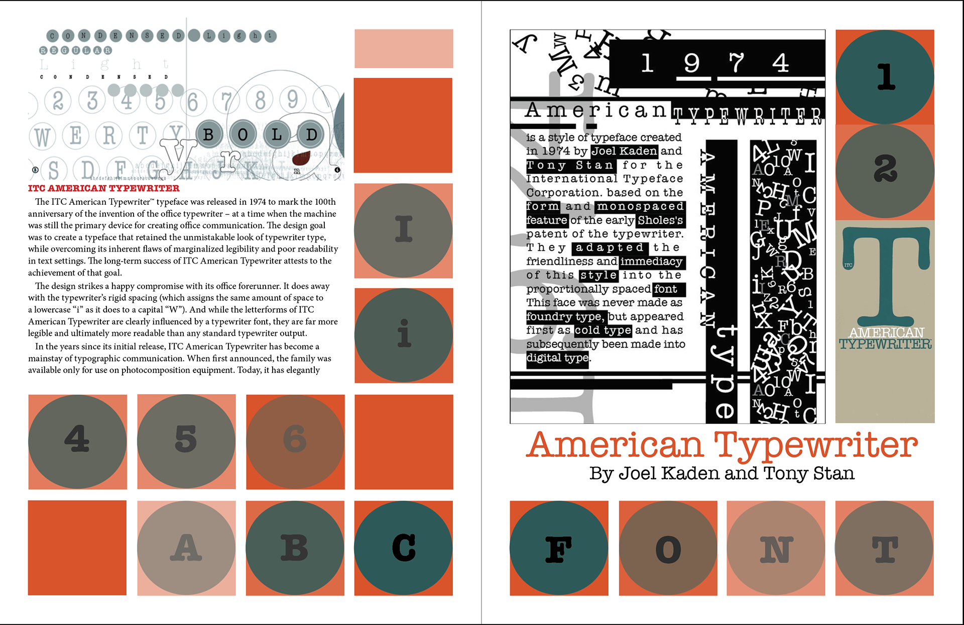
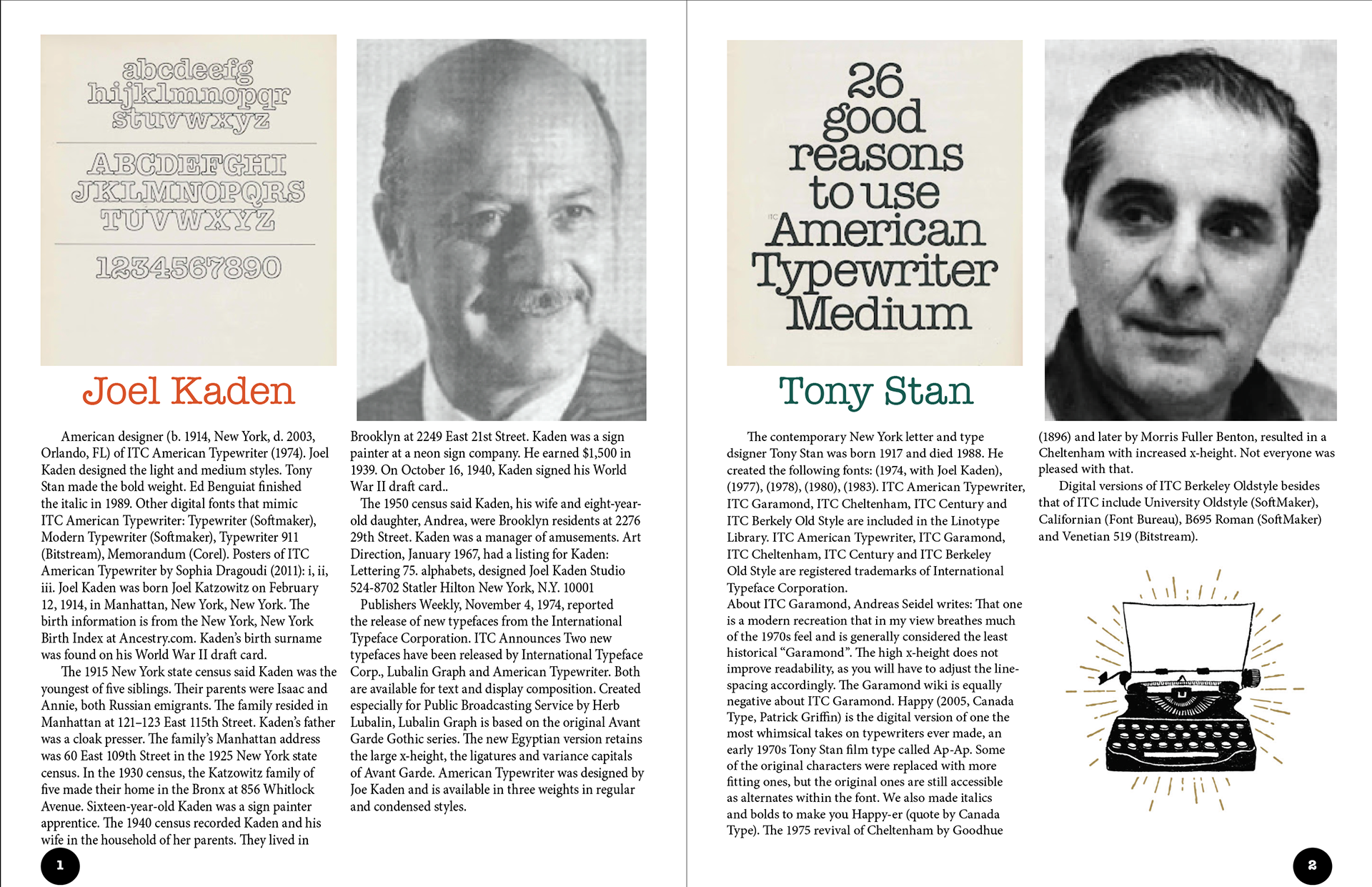
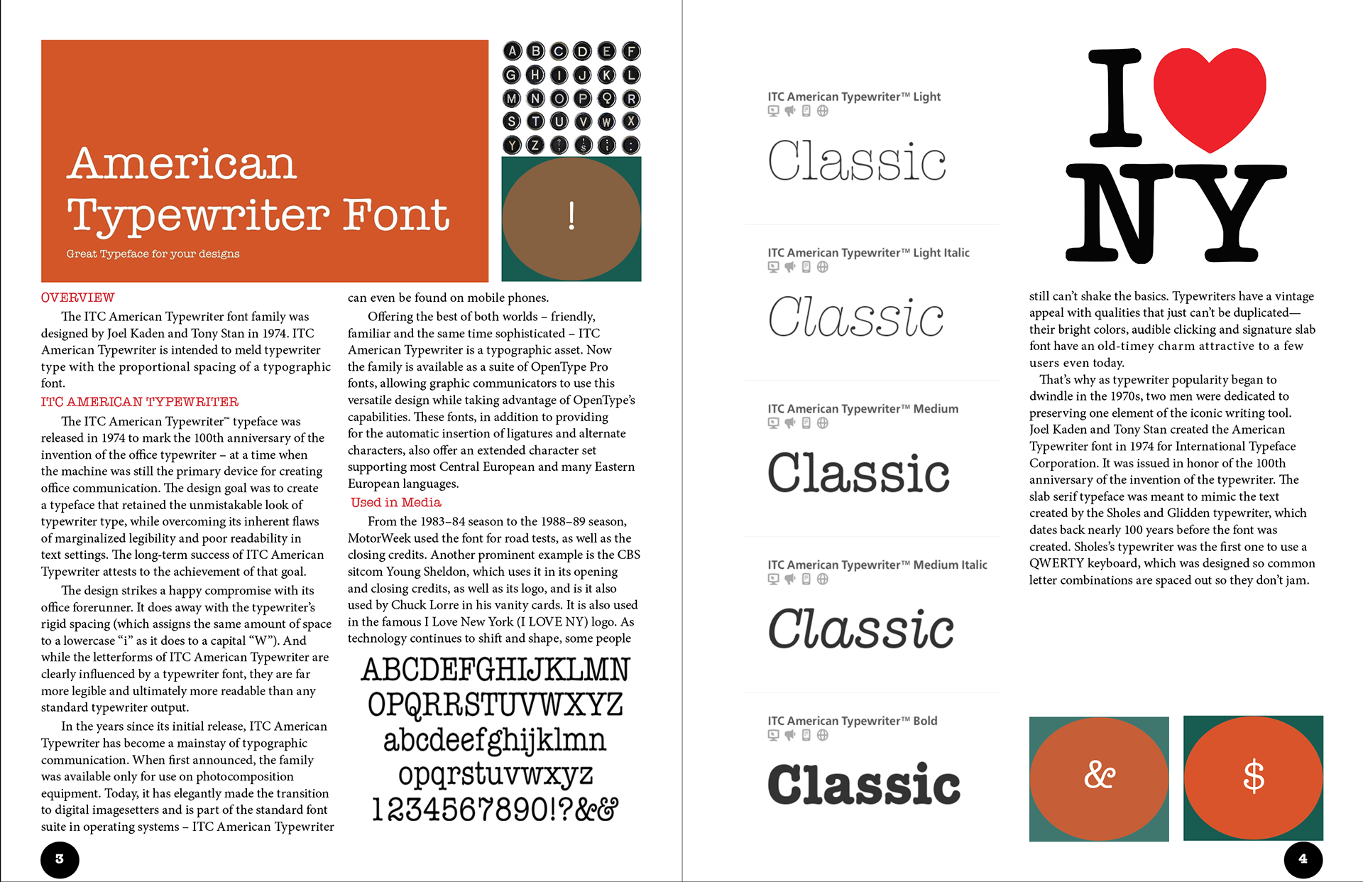
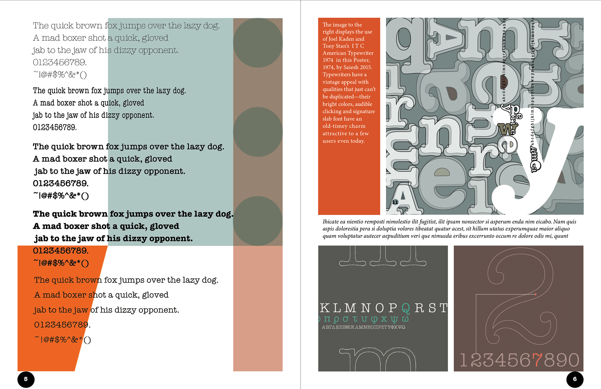
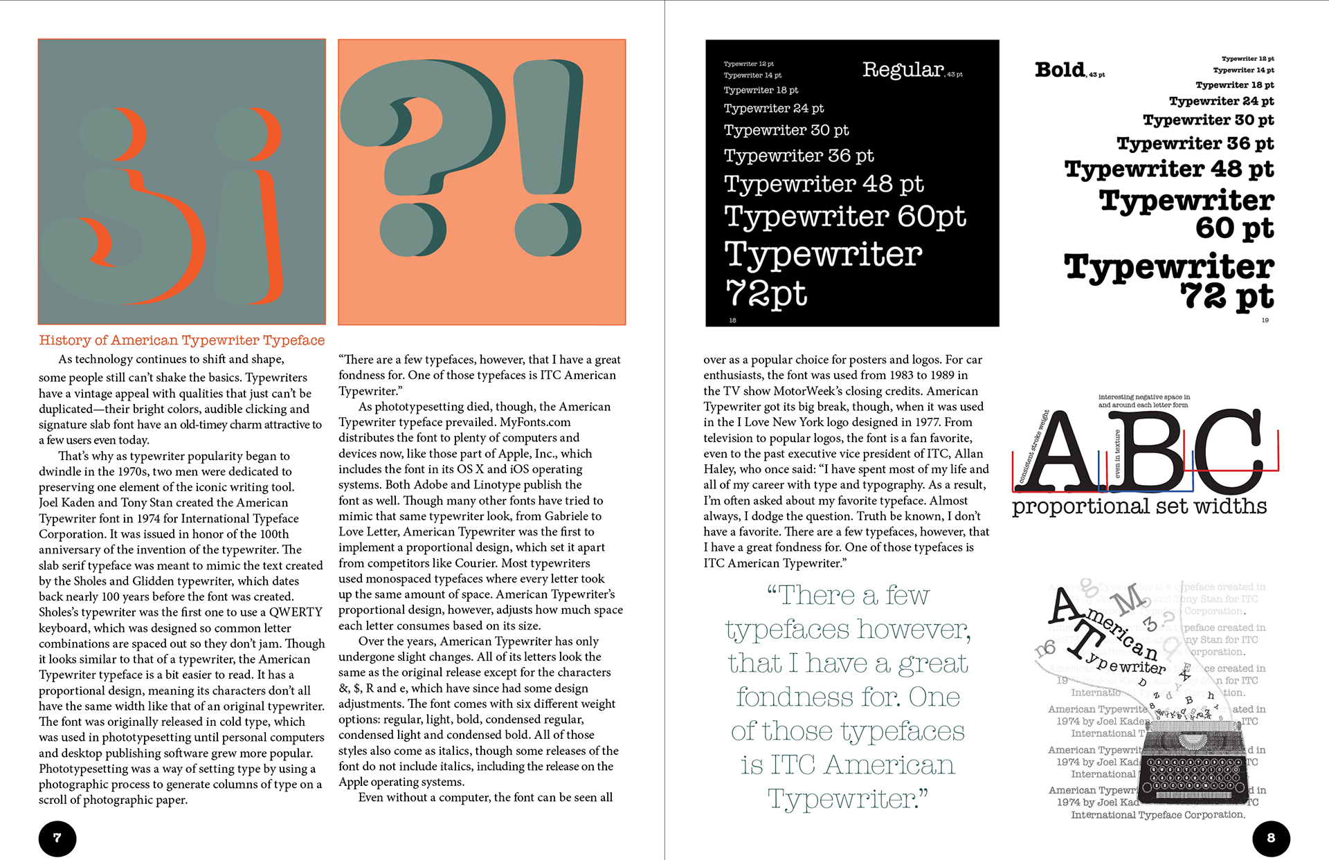
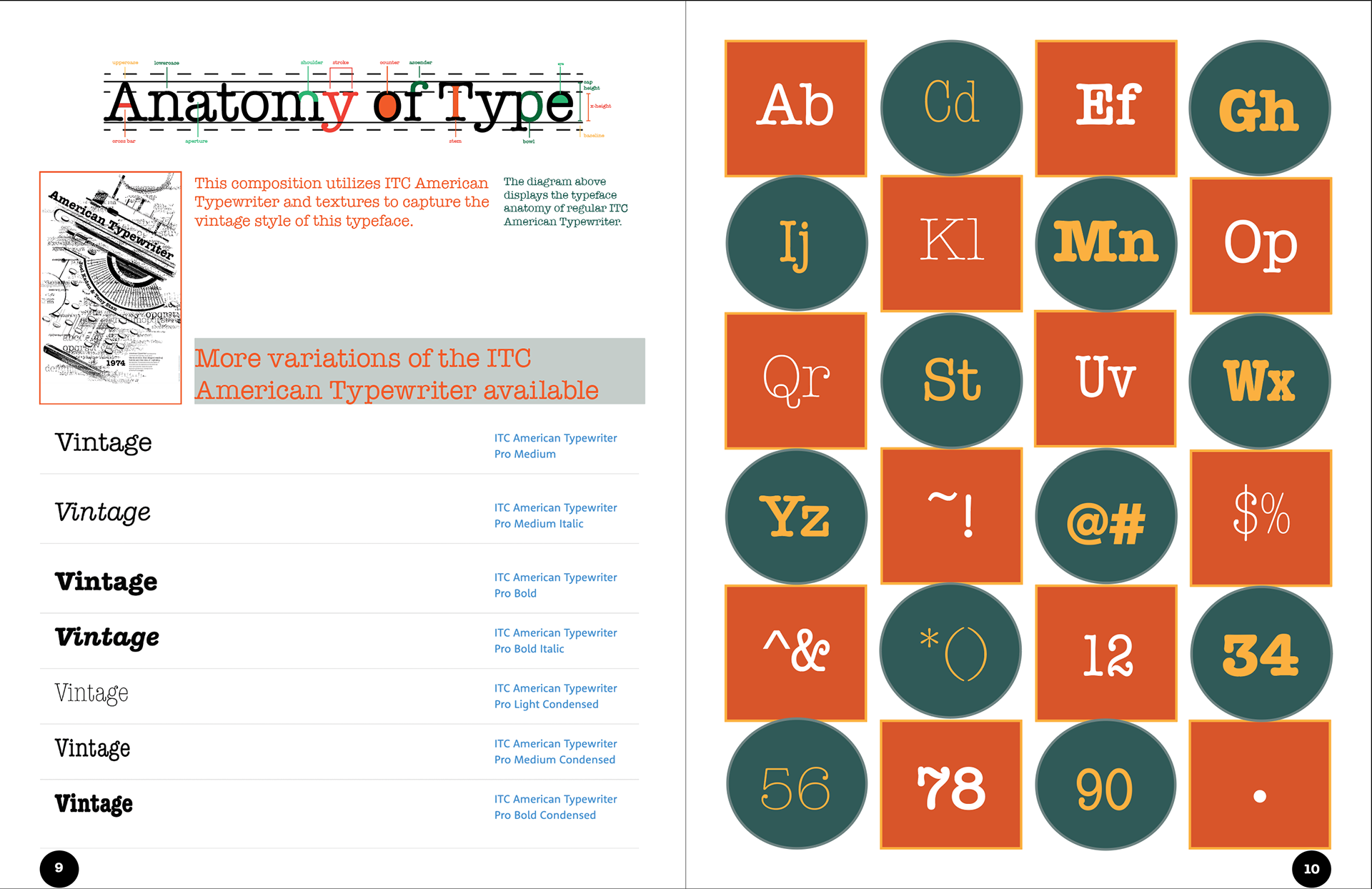
To get a better understanding of type anatomy, I conducted a type study on the American Typewriter font. I used Indesign to create a four-column grid structure for the layout of this booklet. In this design, I focused on choosing a retro color scheme, as I felt it would be very fitting for this font family. Overall, I enjoyed learning about the designers and the variations they have created.
